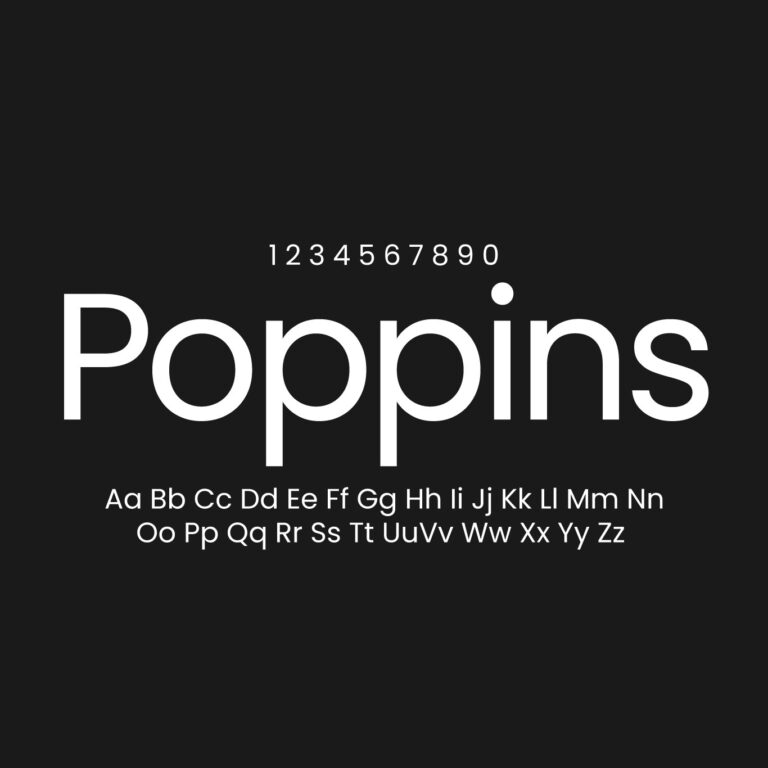
Poppins Font Family Free Download
Poppins is the geometric sans that made the genre truly international. Born in India and released through Google Fonts in 2014, it’s now one of the most-used typefaces on the web — showing up on millions of sites, from startup landing pages to app interfaces. This download includes the full 18-style family: nine weights from Thin to Black, each with a matching italic.
A Geometric Sans from Ahmedabad
Poppins comes from the Indian Type Foundry, based in Ahmedabad, and it’s really two designs in one. Jonny Pinhorn drew the Latin script, while Ninad Kale designed the Devanagari — the writing system behind Hindi, Marathi, and Nepali. Crucially, Kale’s half was a genuine first: the first large Devanagari family ever brought to market in the geometric style, with each font carrying over a thousand glyphs to cover the conjunct forms Indian languages require. The two scripts were engineered to share one voice, built on the same pure circles and near-monolinear strokes.
The foundry itself framed Poppins as part of a longer story. Geometric sans-serifs grew out of 1920s European modernism, but modernism was never only European — Bauhaus instructors were exhibiting in Calcutta just three years after the school’s founding. In that light, Poppins is what the foundry calls an “internationalist take” on the genre: Futura’s tradition, redrawn for a multilingual world. Its rationalist details — like the famously constructed, angular ampersand — push the geometry further than most predecessors dared.

Why It Took Over the Web
Three things carried Poppins from release to ubiquity. First, distribution: launching on Google Fonts made it a one-line embed for any website. Second, range: the family grew from five weights to nine, each with true italics, so a single free family could power an entire design system. Third, character: its tall x-height and soft, circular forms read as modern yet friendly — less rigid than Futura, rounder than Montserrat. As a result, it became a default of startup branding, SaaS sites, and mobile interfaces through the late 2010s and beyond.
One practical caution comes with the territory. Because Poppins is nearly monolinear and strictly geometric, long paragraphs set in it can feel dense and slightly monotonous. It shines in headings, navigation, buttons, and short text blocks. For body copy, pair it with a workhorse like Inter, Open Sans, or a readable serif such as Lora or Source Serif.
Font Information
Font Name: Poppins
Font Type: Sans Serif
Format: TTF
Total Files: 18
Category: Geometric Sans Serif
Visual Style: Clean, circular, modern, friendly
Writing Systems: Latin and Devanagari
Best For: Websites, app interfaces, startup branding, posters, presentations and multilingual design
Designers: Jonny Pinhorn (Latin), Ninad Kale (Devanagari)
Foundry: Indian Type Foundry (Ahmedabad)
Released: 2014
License: SIL Open Font License v1.1

Included Styles
- Poppins-Thin.ttf / Poppins-ThinItalic.ttf
- Poppins-ExtraLight.ttf / Poppins-ExtraLightItalic.ttf
- Poppins-Light.ttf / Poppins-LightItalic.ttf
- Poppins-Regular.ttf / Poppins-Italic.ttf
- Poppins-Medium.ttf / Poppins-MediumItalic.ttf
- Poppins-SemiBold.ttf / Poppins-SemiBoldItalic.ttf
- Poppins-Bold.ttf / Poppins-BoldItalic.ttf
- Poppins-ExtraBold.ttf / Poppins-ExtraBoldItalic.ttf
- Poppins-Black.ttf / Poppins-BlackItalic.ttf
Thin through Light suit elegant, minimal headings. Regular and Medium carry interface text, navigation, and short paragraphs. Meanwhile, SemiBold through Black handle headlines, hero sections, thumbnails, and high-impact display work.
Poppins or Montserrat?
These two get compared constantly, and the difference is temperament. Montserrat — drawn from the signage of Buenos Aires — feels urban and architectural, with wider, flatter letterforms. Poppins is softer, rounder, and slightly more playful. For corporate or editorial confidence, Montserrat usually wins; for friendly, approachable product design, Poppins tends to fit better. Both are free, both span huge weight ranges, and both pair well with the same body-text fonts.
Similar Fonts
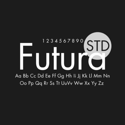


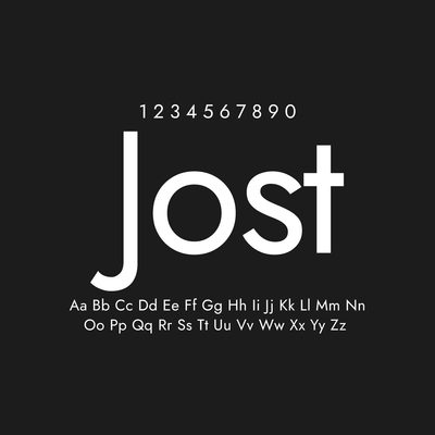
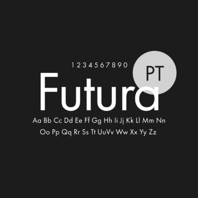
Beyond Montserrat, the closest neighbors are Futura (the century-old commercial classic behind the whole genre), Jost (its strongest free interpretation), and Glacial Indifference (the Bauhaus-flavored Canva favorite). Gilroy and Proxima Nova cover the same ground with premium licensing, while Raleway, Nunito Sans, and Manrope offer related open-source flavors — each a little less strictly geometric than Poppins itself.
License Notice
Poppins is an open-source font released under the SIL Open Font License v1.1; “Poppins” is a trademark of the Indian Type Foundry. You can use it freely in personal and commercial projects, including websites, apps, branding, print, and digital products. As with any OFL font, the files can’t be sold on their own, and the license terms apply to redistribution and modification.


Found this asset useful?
Share your thoughts, ask a question, or let us know what you’d like to see next.