
Montserrat Font Family Free Download
Montserrat began as a rescue mission. A designer walking her Buenos Aires neighborhood realized its hand-painted signs were vanishing — so she turned them into a typeface before the city could erase them. Today, that typeface is one of the five most-used fonts on the entire web. This download includes the full 18-style family: nine weights from Thin to Black, each with a matching italic.
Saving a Neighborhood, One Letter at a Time
Julieta Ulanovsky started the project in 2010 as a postgraduate type design student at the University of Buenos Aires. Her source material was all around her: the posters, painted shop windows, and café signs of Montserrat, the historic neighborhood where she lived — urban lettering from the first half of the twentieth century that was disappearing with each renovation. As she put it in her own project description, the goal was to “rescue the beauty of urban typography” and set it free under an open license, because as development changed the neighborhood, those designs would be lost forever.
Funding came from the crowd. In November 2011, her Kickstarter campaign — asking for $5,000 — closed at $9,747 from 362 backers, and the font launched on Google Fonts shortly after. Initially, the family shipped with just a handful of weights. The full system arrived in 2015, when Ulanovsky collaborated with a team of Argentine designers, including Sol Matas, Juan Pablo del Peral, and Carolina Giovagnoli, to build out nine weights with true italics. Two siblings emerged along the way: Montserrat Alternates, drawn from variant letterforms in the same signage, and Montserrat Subrayada, based on the underlined lettering styles of the neighborhood.

Why It Became a Default of Modern Branding
Montserrat hit a sweet spot the design world was actively searching for. Through the 2010s, geometric sans-serifs like Gotham and Proxima Nova dominated branding — but their licenses cost real money. Montserrat offered the same confident, urban geometry for free, with a weight range big enough to power an entire identity system. Consequently, it became the go-to free stand-in for Gotham, and eventually a first choice in its own right. Its wide proportions and slightly rounded finishes read as modern without feeling cold, which is why it works equally well on a startup landing page and a restaurant menu.
In practice, the family divides cleanly by job. Thin through Light suit elegant, minimal headings and premium display work. Regular and Medium handle interface text, navigation, buttons, and short paragraphs. Meanwhile, SemiBold through Black carry headlines, posters, thumbnails, and hero sections. For long body text, pair it with a reading-first font — its geometry gets tiring over full paragraphs.
Font Information
Font Name: Montserrat
Font Type: Sans Serif
Format: TTF
Total Files: 18
Category: Geometric Sans Serif
Visual Style: Urban, confident, modern, warm-geometric
Best For: Branding, websites, UI design, posters, headlines and identity systems
Designer: Julieta Ulanovsky (with Sol Matas, Juan Pablo del Peral, Jacques Le Bailly and others)
Origin: Montserrat neighborhood, Buenos Aires
Released: 2011 (full 18-style family: 2015)
License: SIL Open Font License
Included Styles
- Montserrat-Thin.ttf / Montserrat-ThinItalic.ttf
- Montserrat-ExtraLight.ttf / Montserrat-ExtraLightItalic.ttf
- Montserrat-Light.ttf / Montserrat-LightItalic.ttf
- Montserrat-Regular.ttf / Montserrat-Italic.ttf
- Montserrat-Medium.ttf / Montserrat-MediumItalic.ttf
- Montserrat-SemiBold.ttf / Montserrat-SemiBoldItalic.ttf
- Montserrat-Bold.ttf / Montserrat-BoldItalic.ttf
- Montserrat-ExtraBold.ttf / Montserrat-ExtraBoldItalic.ttf
- Montserrat-Black.ttf / Montserrat-BlackItalic.ttf
Montserrat Font Pairings
The practical recipe: Montserrat for headings, navigation, and buttons, plus a quieter font for body text. For clean digital layouts, Open Sans, Roboto, Inter, Source Sans, Lato, or Nunito all work naturally. For editorial and elegant designs, pair it with Lora, Libre Baskerville, Merriweather, Playfair Display, Cormorant Garamond, or Source Serif — the serif contrast lets Montserrat’s geometry do the talking up top.
Similar Fonts


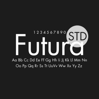

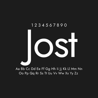
Gotham is the commercial classic Montserrat most often substitutes for — fittingly, both were drawn from city signage, Gotham from New York’s and Montserrat from Buenos Aires’. Proxima Nova, Avenir, and Futura cover neighboring premium territory, while Poppins, Raleway, Jost, and Nunito Sans are the strongest free alternatives. For a premium option in the same lane, Gilroy and Satoshi continue the geometric tradition with their own flavors.
License Notice
Montserrat is an open-source font released under the SIL Open Font License. You can use it freely in personal and commercial projects, including websites, apps, branding, packaging, print, and digital products. As with any OFL font, the files can’t be sold on their own, and the license terms apply to redistribution and modification.
FAQ
Is Montserrat a good alternative to Gotham?
Yes — it’s the most common free substitute. The two aren’t identical: Gotham is slightly more austere, Montserrat a touch warmer and wider. But they share the same confident geometric character, and Montserrat’s 18 free styles cover most jobs a Gotham license would.
They’re official siblings drawn from the same Buenos Aires signage. Alternates uses variant letterforms found in the neighborhood’s lettering, while Subrayada (“underlined” in Spanish) recreates its underlined sign-painting style. Both are free on Google Fonts.
In short runs, yes — Regular and Medium handle interface text and brief paragraphs well. For long-form reading, its strict geometry grows monotonous, so pair it with a text-optimized font like Lora or Source Serif instead.


Found this asset useful?
Share your thoughts, ask a question, or let us know what you’d like to see next.