Frutiger LT Font Free Download
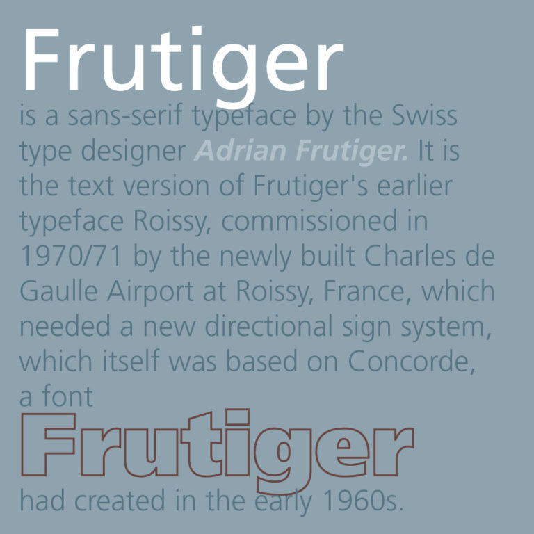
Frutiger is a sans-serif typeface by the Swiss type designer Adrian Frutiger. It is the text version of Frutiger’s earlier typeface Roissy, commissioned in 1970/71 by the newly built Charles de Gaulle Airport at Roissy, France, which needed a new directional sign system, which itself was based on Concorde, a font Frutiger had created in the early 1960s.
The beginning of Frutiger starts from Concorde, a sans-serif font Frutiger was commissioned to design in 1961-4 by the minor metal type company Sofratype. Frutiger was asked to create a design that would not be too similar to his previous Univers, a reinvention of classic 19th-century typefaces. In practice the design was drawn by his colleague (and fellow Swiss in Paris) André Gürtler as Frutiger was busy. Frutiger wrote of it: “I felt I was on the right track with this grotesque; it was a truly novel typeface.” Gürtler too wrote of feeling that the design was innovative: “this style didn’t exist in grotesques at the time, except for Gill Sans.” Despite Frutiger and Gürtler’s enthusiasm, the design failed to sell well and was discontinued with the end of the metal type period: Frutiger wrote that Linotype, who bought Sofratype, “weren’t aware of the fact that with Concorde they had a totally up-to-date typeface.”
Some years later, Frutiger was commissioned to develop a typeface for Roissy Airport. Frutiger had earlier created an alphabet inspired by Univers and Peignot for Paris Orly Airport, but found the experience a failure due to lack of control and the insistence that all text be in capitals only. As a result, he proposed a modified version of Concorde, refining it following research into legibility. The Roissy typeface was completed in 1972. Impressed by the quality of the Roissy airport signage, the typographical director of the Mergenthaler Linotype Company approached Frutiger in 1974 to turn it into a typeface for print.
In designing the typeface’s predecessors Concorde and Roissy, Frutiger’s goal had been to create a sans-serif typeface with the rationality and cleanliness of Univers but the organic and proportional aspects of Gill Sans. According to Frutiger, “What was important, was total clarity – I would even call it nudity – an absence of any kind of artistic addition.” Designing Frutiger as a print version of Roissy, this principle resulted in a distinctive and legible typeface. The letter properties originally suited to the needs of Charles de Gaulle: a modern appearance and legibility at various angles, sizes, and distances. Ascenders and descenders are very prominent, and apertures are wide to easily distinguish letters from one another. Improvements on Roissy included better spacing.
The Frutiger family was released publicly in 1976 by the Stempel type foundry in conjunction with Linotype. Frutiger became extremely popular for uses such as corporate and transportation branding. In 2008 it was the fifth best-selling typeface of the Linotype foundry.
Download for Free


