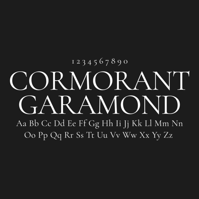
Cormorant Garamond Font Family Free Download
Download Cormorant Garamond font family for free in TTF format. This package includes 10 static styles and 2 variable font files for elegant, high-contrast serif typography.
Cormorant Garamond is part of the larger Cormorant type family, designed by Christian Thalmann of Catharsis Fonts. It takes inspiration from the spirit of Garamond-style old-style serifs, but it was drawn as a modern display family rather than a direct historical revival.
The font has sharp serifs, high contrast, elegant proportions and true italic styles. It works best for large, refined typography such as book covers, invitations, editorial headlines, luxury layouts, packaging and website headings.
Font Details
Font Name: Cormorant Garamond
Font Type: Serif
Format: TTF
Static Files: 10
Variable Files: 2
Weights: Light, Regular, Medium, SemiBold and Bold
Designer: Christian Thalmann
Foundry: Catharsis Fonts
Released: 2015
Category: Display Serif / Garamond-inspired Serif
License: SIL Open Font License 1.1
Download Options
Static Font Family
Use the static files when you want each weight and italic as a separate TTF file. This option is practical for design apps, print files and predictable font menus.
Variable Font Family
Use the variable files when you want flexible weight control from fewer font files. The variable version covers the Light-to-Bold range, with a separate file for italics.
Try the Font
Character Map


Included Static Styles
CormorantGaramond-Light.ttf
CormorantGaramond-LightItalic.ttf
CormorantGaramond-Regular.ttf
CormorantGaramond-Italic.ttf
CormorantGaramond-Medium.ttf
CormorantGaramond-MediumItalic.ttf
CormorantGaramond-SemiBold.ttf
CormorantGaramond-SemiBoldItalic.ttf
CormorantGaramond-Bold.ttf
CormorantGaramond-BoldItalic.ttf
Included Variable Files
CormorantGaramond-VariableFont_wght.ttf
CormorantGaramond-Italic-VariableFont_wght.ttf

About the Design
Cormorant Garamond is more dramatic than a typical book serif. Its thin hairlines, sharp terminals and high contrast give it a refined display character.
Light and Regular work best in large headings where the delicate details can show. Medium and SemiBold are safer for smaller titles. Bold gives the family more presence for covers, posters and stronger editorial layouts.
The italic styles are one of the strongest parts of the family. They feel more calligraphic and expressive than the upright styles, which makes them useful for invitations, pull quotes, names and elegant short phrases.
Cormorant Garamond vs EB Garamond
Cormorant Garamond and EB Garamond are often compared, but they do different jobs. Cormorant Garamond is more display-focused, sharper and more decorative.
EB Garamond is better for long reading and body text. Cormorant Garamond is better for headlines, covers, invitations and layouts where the type needs to feel more elegant and visible.
A practical pairing is to use Cormorant Garamond for headings and EB Garamond for body copy. That keeps the visual connection while improving readability.
For official source files and license details, see the Cormorant GitHub repository. You can also view the family on Adobe Fonts.
Similar Fonts


EB Garamond is the better choice for long reading. Playfair Display gives a more fashionable editorial look. Crimson Text feels warmer and quieter. Cardo and Spectral are also worth checking when you need a more restrained serif.
Found this asset useful?
Share your thoughts, ask a question, or let us know what you’d like to see next.